This is part 1 in a series on year-on-year charts with variance. The others are:
The Grattan Institute recently produced a report on how Australia can and should aim to reduce community transmission of COVID-19 to zero – i.e. an elimination strategy.
While their report was full of great charts, one in particular stood out as a terrific way to compare current year to the average of prior years, while still showing a proxy of variance in that average.
Instead of using standard deviation to create a confidence interval, they instead just showed min and max years around the average – which made it clear when 2020 was an outlier. Using statistical variance with only five data points for the average of 2015-2019 could be done, but may have been volatile.
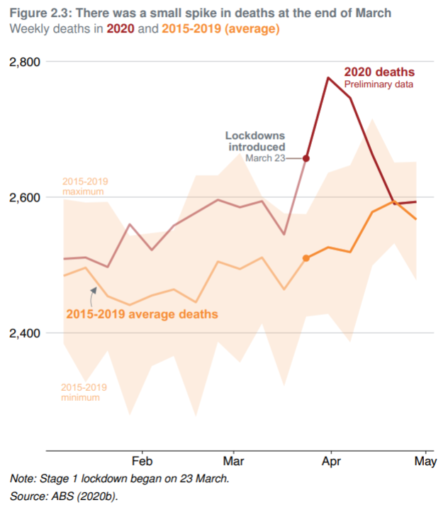
It tops this off with:
- a great title giving commentary (using the subtitle to provide the descriptive information of weekly deaths by year over time)
- contrasting colours
- clear labeling (so even with achromatopsia you could read this)
- a well defined hierarchy so your eyes focus on the most important labels first
- source to be able to trace the data yourself
This is just one of many great charts. There are many well-done trellis charts, and a great cumulative line chart, alongside the usual candidates of line and bar charts.
All in all, a very readable and interesting report for its analysis and recommendations, all amplified by the thoughtful and engaging charts.