Recently I gushed about the quality of a recent Grattan Report chart which compared current year to the average of prior years while also showing a proxy for variance.
Now I want to show how to make a similar chart in Excel.
This is part 2 in a series on year-on-year charts with variance. The others are:
Collecting the data
First start by getting some monthly data over multiple years. Rainfall data from the Bureau of Meteorology will do – I take my readings from the station at the Melbourne Botanical Gardens, download the data and delete all rows before 2015. You can also get the data here if you don’t want to stress about the formatting below.
After downloading copy cells C1:O1 and place them below your data (so on cell C9:O9), so all the chart information is together. You’ll also add four formulas being:
First formula – adding 2020
- In
C10write 2020. This will be our 2020 year of data. - In
D10write=D$7because we’ll be taking the 2020 values.- The dollar sign locks the formula onto row 7, so even if we were to copy these formulas down, it would still be referring to the right row. It is not strictly necessary here, but is good practice and Excel hygiene to avoid errors.
- Then highlight
D10:O10and press CTRL + R to copy the formula to all cells.
Second formula – adding the average of years 2015-2019
- In
C11write 2015-2019 (average). This row will be the mean line for years 2015 through to 2019. - In
D11write=AVERAGE(D$2:D$6)to take the mean of those cells.- What about where it says “null”?
- No worries! The formula will ignore any cells that say blank because they are text fields and not numbers.
- Like before highlight
D11:O11and press CTRL + R to copy the formula to all cells.
Third and fourth formulas – adding the maximum and minimum from years 2015-2019
- In
C12write 2015-2019 (maximum). InC13write 2015-2019 (minimum). These will help create the area around the average line that proxies deviation from the mean. - In
D12write=MAX(D$2:D$6)and inD13write=MIN(D$2:D$6). These look similar but pull the minimum and maximum values from each month for the years of 2015 to 2019. - Now highlight both
D12:D13, highlight toO12:O13and press CTRL + R to copy the formula to all cells.
Making the chart
Perfect! We now have all the information we need to make our chart.
Highlight your data (from C9:O13) the go to the ribbon and click Insert, and Recommended Charts.
Just pick the line chart (second one for me). We’ll be editing this to turn it into exactly what we want.
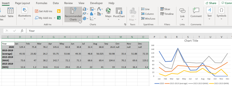
Now we’ve made the chart, we’ll instantly be changing it.
Right click the chart and choose ‘Change chart type’.
Go to the bottom of the list and choose Combo. You want to choose ‘Line’ for the 2020 and 2015-2019 (average) data, and ‘Area’ for the MAX and MIN data. Press OK to see the new chart.
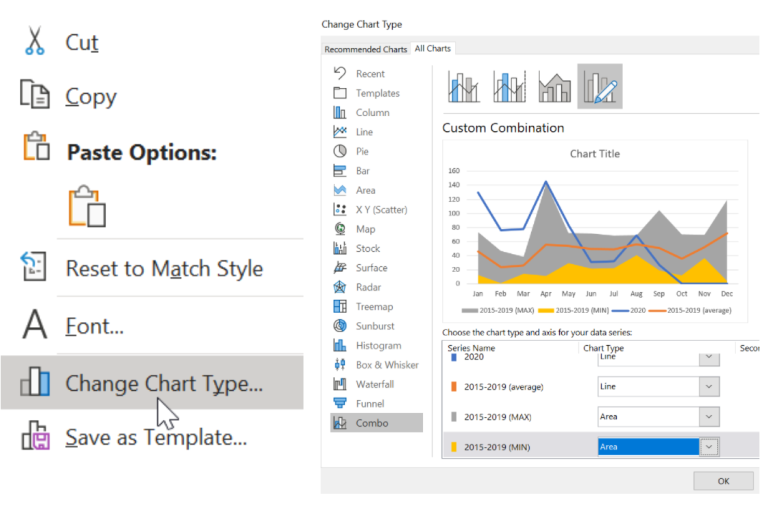
It’ll be a little ugly but we are getting somewhere.
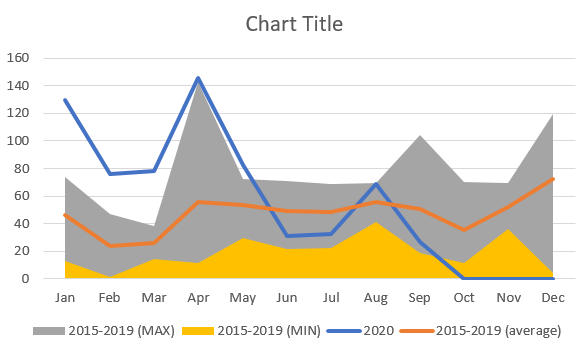
The key is now right clicking the MIN section (yellow for me) and changing the colour to white to give the chart negative space in that zone.
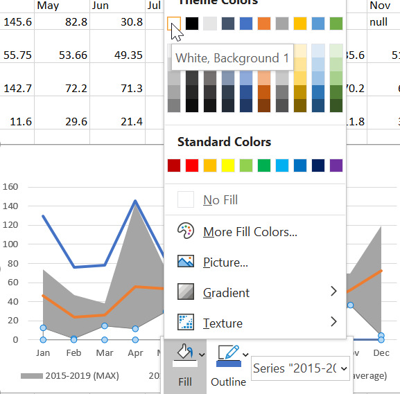
More formatting
While I’m here, I’ll change some more things such as:
- Removing Gridlines (just click one of the lines and press delete)
- Removing the min and max from the legend (just click the legend on the chart, then click again on the specific legend item you want to delete)
- Changing the colour of the min-max area (right click highlighted area, and change Fill colour like we did before)
- Changing the colour of the two lines (right click each line, choose Outline, and pick your colour of choice) Changing the font for the whole chart (Click the chart, then in the ribbon just change it from the default ‘Calibri’. I chose Selawik Light)
- Adding a title (just double click into the area that says Chart Title)
- Adding a y-label (Click the chart, go to Chart Design in the ribbon at the top, click Add Chart Element, choose Axes Title, and then choose Primary Vertical)
- Adding min and max labels (In the ribbon, click Insert, then on the far right click Text and choose Text Box. Drag them manually to where it makes sense)
End result doesn’t look too bad!
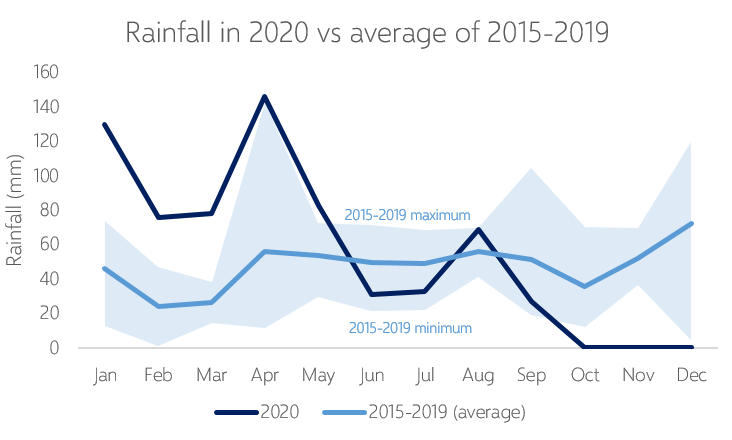
Hope this helps you create charts that allow more insight into year-on-year analyses. Be creative and try different things.