This is part 3 in a series on charting year-on-year variance. The others are:
This is a brief tutorial on creating a year-on-year chart with variance in Python. This notebook is also in a github repo here.
Starting with importing libraries and the data
import pandas as pd
import matplotlib.pyplot as plt

f = 'https://raw.githubusercontent.com/ryanward-io/year-on-year-variance/main/IDCJAC0001_086232_Data.csv'
rainfall = pd.read_csv(f)
rainfall = rainfall.iloc[-6:].drop(['Product code', 'Station Number', 'Annual'], axis=1).set_index('Year').T.copy()
rainfall
| Year | 2015 | 2016 | 2017 | 2018 | 2019 | 2020 |
|---|---|---|---|---|---|---|
| Jan | 56.8 | 53.4 | 33.2 | 73.6 | 12.6 | 129.4 |
| Feb | 41.4 | 9.2 | 47.0 | 1.2 | 20.3 | 75.8 |
| Mar | 24.4 | 38.2 | 29.2 | 24.6 | 14.6 | 78.2 |
| Apr | NaN | 49.7 | 142.7 | 19.0 | 11.6 | 145.6 |
| May | 42.8 | 60.2 | 29.6 | 72.2 | 63.5 | 82.8 |
| Jun | NaN | 71.3 | 21.4 | 47.2 | 57.5 | 30.8 |
| Jul | 65.0 | 68.6 | 35.6 | 22.0 | 52.8 | 32.4 |
| Aug | 41.0 | 69.4 | NaN | 49.4 | 64.3 | 68.8 |
| Sep | 33.2 | 104.6 | 46.7 | 19.0 | 51.4 | 26.8 |
| Oct | 11.8 | 70.2 | 43.4 | 24.9 | 27.7 | NaN |
| Nov | 46.4 | 36.4 | 46.2 | 69.6 | 60.8 | NaN |
| Dec | NaN | 47.7 | 119.2 | 117.3 | 4.4 | NaN |
Make 2015-19 average, min and max columns
yr_2015_2019_cols = [2015, 2016, 2017, 2018, 2019]
rainfall['2015-2019 avg'] = rainfall.loc[:, yr_2015_2019_cols].mean(axis=1)
rainfall['2015-2019 max'] = rainfall.loc[:, yr_2015_2019_cols].max(axis=1)
rainfall['2015-2019 min'] = rainfall.loc[:, yr_2015_2019_cols].min(axis=1)
rainfall_yoy = rainfall.drop(yr_2015_2019_cols, axis=1)
rainfall_yoy
| Year | 2020 | 2015-2019 avg | 2015-2019 max | 2015-2019 min |
|---|---|---|---|---|
| Jan | 129.4 | 45.920 | 73.6 | 12.6 |
| Feb | 75.8 | 23.820 | 47.0 | 1.2 |
| Mar | 78.2 | 26.200 | 38.2 | 14.6 |
| Apr | 145.6 | 55.750 | 142.7 | 11.6 |
| May | 82.8 | 53.660 | 72.2 | 29.6 |
| Jun | 30.8 | 49.350 | 71.3 | 21.4 |
| Jul | 32.4 | 48.800 | 68.6 | 22.0 |
| Aug | 68.8 | 56.025 | 69.4 | 41.0 |
| Sep | 26.8 | 50.980 | 104.6 | 19.0 |
| Oct | NaN | 35.600 | 70.2 | 11.8 |
| Nov | NaN | 51.880 | 69.6 | 36.4 |
| Dec | NaN | 72.150 | 119.2 | 4.4 |
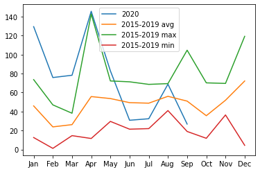
Let’s check what it looks like out of the box
plt.plot(rainfall_yoy)
plt.legend(rainfall_yoy.columns)
plt.show()
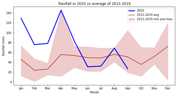
Plotting the nicer looking chart
# data
x = rainfall_yoy.index.values
y_2020 = rainfall_yoy[2020].values
y_2015_2019_avg = rainfall_yoy['2015-2019 avg'].values
y_2015_2019_max = rainfall_yoy['2015-2019 max'].values
y_2015_2019_min = rainfall_yoy['2015-2019 min'].values

# initialise the plot and plot the three charts
fig, ax = plt.subplots(figsize=[10,5])
ax.plot(x, y_2020, '-', color='#0000ff', linewidth=3)
ax.plot(x, y_2015_2019_avg, '-', color='#aa0000')
ax.fill_between(x, y_2015_2019_min, y_2015_2019_max, color='#aa0000', alpha=0.2)

# add out legend and labels
ax.legend(['2020', '2015-2019 avg', '2015-2019 min and max'])
ax.set_xlabel('Month')
ax.set_ylabel('Rainfall (mm)')
ax.set_title('Rainfall in 2020 vs average of 2015-2019')

plt.show()
Enjoy!